By: William Robinson
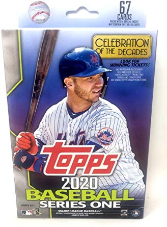
Topps this past week released it’s flagship product for the 2020 baseball season. Let’s take a look at it below:

As you can see from the first picture the cards have a borderless design which Topps has done now for the past several years. The pictures are clean and crisp and the name is displayed on the side. The positioning of the name on the side of the card can make it difficult to see the names if you are sliding the cards through your fingers looking though them. The design itself is kind of boring and not particularly creative. As far as the back is concerned. It would be difficult to tell them apart from previous years.
The inserts this year leave much to be desired as well. In previous years there were bright colorful inserts that you could easily see being translated to a chrome product. This is not the case this year. Decades Best takes a look at some of the best players of each decade and looks like it came straight out of the garbage. Seriously what’s up with the lines on the side? It looks like they didn’t take the time to remove it from the graph paper. Now I know that they were going for a Saved By the Bell look and that every other card in this subset has a look of the decade but none of them are in the slightest bit impressive.

Decade’s next is as plain as a card comes. Black and white background with picture of the player in the foreground. They may look sharper in chrome though.

Decade of Dominance is a die cut card. It doesn’t have any colors that pop out at you and the card stock that it’s printed on is very flimsy. These cards will likely be damaged quite frequently. This one should have been a chrome card for sure.
The Homerun challenge cards return this year if you like to damage your cards by scratching the backs off of them. The throwback set this year is 1985 which was a pretty neat year for cards to at least that card looks nice. It was surreal to see the players that actually played in 1985 on these cards. I opened up a hobby box and got Nolan Ryan and I’m curious to compare that to his actual 1985 card.

Finally we have the Turkey Red inserts. I’m sorry but I don’t see the point of Topps continuously throwing back to designs that weren’t even theres at the time. It may not be a popular opinion but these cards are extremely plain and uninteresting. I’m also sick of Topps being lazy and not coming up with new designs and instead throwing back to previous years.

So in conclusion: Topps faces a difficult proposition with it’s flagship product each year. As “the main baseball card product” Topps has to deal with a lot of different people who have different tastes. There are the traditional folks who want their cards to look as plain as possible and love the throwbacks to previous cards. I myself treasure creativity and shiny colorful cards and so the current product does not entertain me very much. As such, I doubt that I will be buying much of it in this form until Chrome comes out. However, I do encourage everyone to give it a chance.